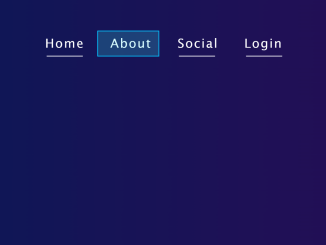
This HTML & CSS code snippet helps you to create a stylish horizontal menu bar with hover effect. The menu features a unique hover effect, with animated strokes and color transitions. The CSS styling ensures a responsive and visually appealing layout. Helpful for enhancing website navigation and adding a touch of interactivity to your user interface.
You can implement this code on your website’s header for a sleek and interactive navigation menu. Moreover, you can customize the menu bar with additional CSS according to your website’s design.
How to Create a Horizontal Menu Bar In HTML with Hover Effect
1. First, copy the following HTML code and paste it where you want to display the menu bar in your project. Customize the menu items and links according to your website’s sections.
<div class="menu">
        <ul>
            <li>
                <a href="">
                    <svg>
                        <rect></rect>
                    </svg>
                    home
                </a>
            </li>
            <li>
                <a href="">
                    <svg>
                        <rect></rect>
                    </svg>
                    about
                </a>
            </li>
            <li>
                <a href="">
                    <svg>
                        <rect></rect>
                    </svg>
                    social
                </a>
            </li>
            <li>
                <a href="">
                    <svg>
                        <rect></rect>
                    </svg>
                    login
                </a>
            </li>
        </ul>
    </div>
2. Now, add the CSS code to your project’s stylesheet. This styling is important for achieving a responsive layout, font choices, and eye-catching hover effect.
body {
  margin: 0;
  padding: 0;
  height: 100vh;
  width: 100%;
  background: linear-gradient(to right, #061957, #2d0b55);
}
.menu ul {
  display: flex;
  position: absolute;
  left: 50%;
  top: 50%;
  transform: translate(-50%, -50%);
  margin-left: -80px;
}
li {
  list-style: none;
}
.menu a {
  position: relative;
  text-decoration: none;
  width: 180px;
  height: 60px;
  text-align: center;
  line-height: 50px;
  font-family: "Lucida Sans", "Lucida Sans Regular", "Lucida Grande",
    "Lucida Sans Unicode", Geneva, Verdana, sans-serif;
  text-transform: capitalize;
  font-size: 24px;
  color: #fff;
  letter-spacing: 2px;
}
.menu a:last-child {
  margin-left: 50px;
}
.menu a svg,
.menu a svg rect {
  position: absolute;
  left: -25px;
  width: 120px;
  height: 50px;
  fill: transparent;
}
.menu a svg rect {
  stroke: #fff;
  stroke-width: 3;
  transition: 0.8s;
  stroke-dasharray: 70, 402;
  stroke-dashoffset: 280;
}
.menu a:hover svg rect {
  stroke-dasharray: 500, 500;
  stroke-dashoffset: 0;
  stroke: #00c3ff;
  fill: rgba(0, 250, 255, 0.2);
  color: #fff;
 }
The hover effect is achieved through the transition and stroke-dash properties. Experiment with these values to modify the animation duration and stroke appearance when hovering over menu items.
That’s all! hopefully, you have successfully created a horizontal menu bar on your website. If you have any questions or suggestions, feel free to comment below.


Social Plugin